Chloe Carr
Module #11: Art Works Work for Art
Questions about the exhibit:
1. Title of the exhibit: Burchfield's Arboretum- A Celebration of Trees
2. Theme of exhibit: Trees
"I watched an elm tree- a star slowly shown forth and suddenly disappeared. What wanders the passing sky holes revealed!"
- Charles E. Burchfield, January 15, 1917
Questions about the physical space:
1. The lighting for the paintings are the same. They are kept in lighting that is bright but not very intense. The lighting of the paintings themselves change; some paintings of the different kinds of trees are dark, bright, and even hold different moods to them.
2. The colors of the walls are cream colored, or almost a pale peach color.
3. There weren't any exact materials for the space around the paintings besides the quote pasted on the wall with a quote from Charles Burchfield. Beside the quote is a painting of a tree painted by Burchfield himself. There was also a banner of trees on either side of one painting.
4. I found it easy, as a viewer to the exhibit, to maneuver through the exhibit. I first walked in to where I saw the title of the exhibit and the quote and what I guess was the 'opening painting' to the exhibit. In front of the title was a string of paintings of some trees, all different and from the same artist: Charles Burchfield.
Questions about the artwork:
1. I don't think the artworks were organized in any specific way, and if they were I haven't yet figured out how. They seem to be mixed; the artworks jumped from being abstracted paintings of trees to realistic paintings of trees. There was one painting that had a boy sitting in the center of a wood with a tree behind him, which seemed to be mixed in with the rest of the paintings of trees all around it.
2. The artworks are similar in that they all have an emphasis on lines and form. There are paintings that have no color, and not all paintings have all of the same principles or elements of art but all of the paintings have evident lines.
3. The artworks are different in that they have different moods to them. Some of the paintings of the trees are made from dark colors and hard lines and others are made of soft, gloomy colors and soft lines. Other paintings are made with bright colors or realistic colors. Some don't have any color at all and are simply made from shades.
4. The artworks are framed differently for each painting. Some paintings have dark framed and others have bright wood.
5. The artworks are labeled and identified by a little plaque next to the paintings that have the artist's name, year made, medium.
6. The paintings are not more than 10 minutes away from each other.
Artist: Charles Burchfield
Title: Unitled
Media: Crayon on paper
Date: 1963-1967
Size: N/A
This art work is of a tree, but it is made up of just lines. There are no other colors and the form of the trees are made up of the lines only. Lines, form, emphasis, and space are the only elements/principles that I noticed, which is why the tree stands out against all of the space around it. I think this artwork is stressing the importance of a simple form of life, since trees can sometimes represnt life
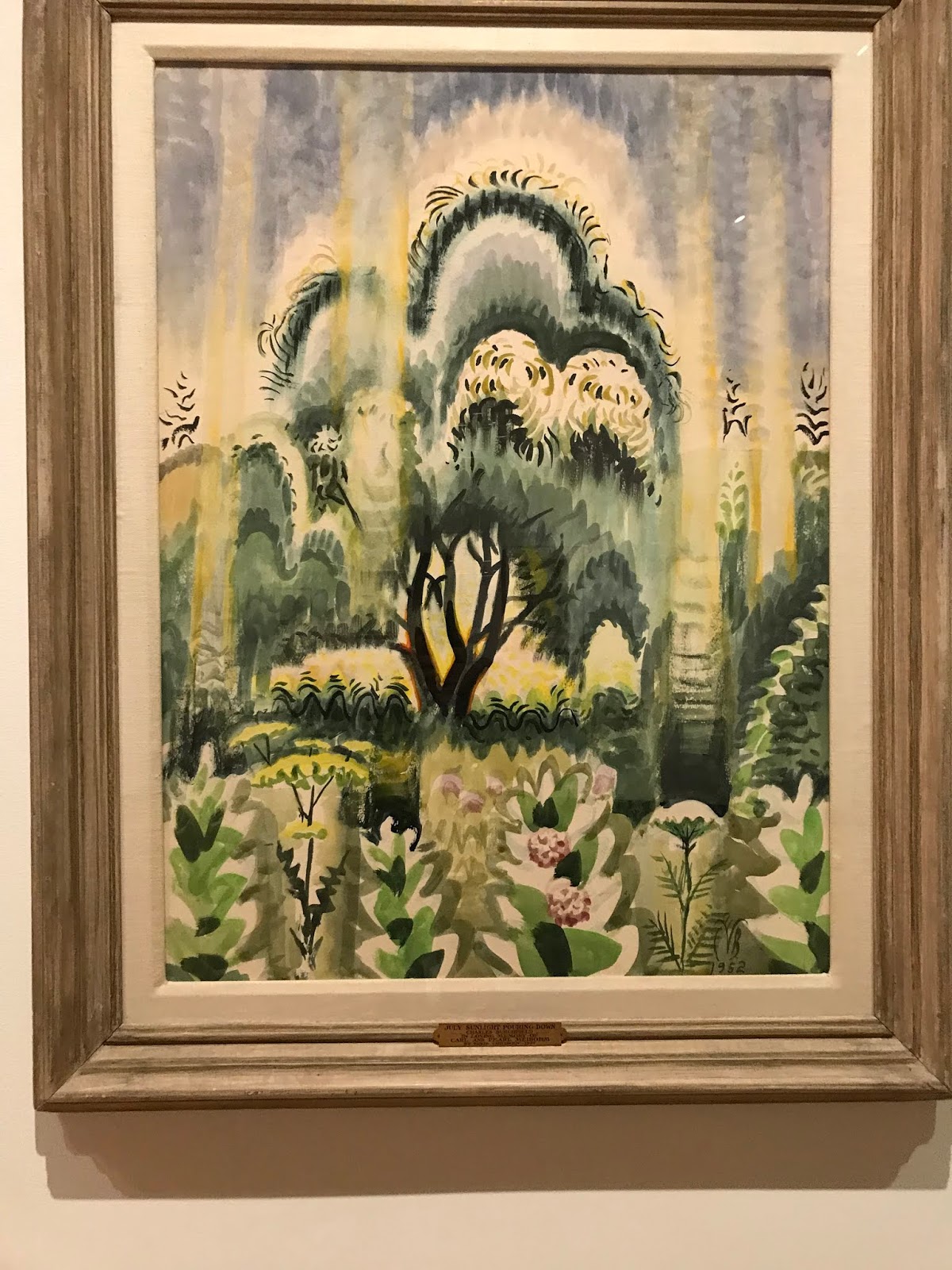
Artist: Charles Burchfield
Title: July Sunlight Pouring Down, a.k.a. Sunlight Pouring Down
Media:Watercolor on paper
Date: 1952
Size: N/A
This artwork is of a tree with sunlight that looks like it is literally pouring down on it. The tree seems to be the only one and the leaves on it are rounded and full. There are plants and flowers surrounding it. Some elements/principles of art that I noticed are color because the color scheme is almost the same throughout the work, form and emphasis because the tree stands out against everything else around it and behind it.
Artist: Charles Burchfield
Title: Untitled (Willow Tree and Rooftop)
Media: Watercolor and pencil on paper
Date: April 1916
Sixe: N/A
This artwork is of a single tree sitting on a dark rooftop. The branches of this tree are thin and look very fragile yet the drooping leaves don't seem to bring down the branches. Some elements/principles in this artwork are color because of the intense green and black, and space because there is nothing else around or in front of the tree and rooftop.
1. I enjoyed visiting the Gallery adn looking at the exhibition from a different prespective. Although this wasn't my first time vising the gallery and looking at paintings, this was my first time really giving more attention to the layout of exhibitions. I payed attention things that I wouldn't normally have payed attention to. I focused on the lighting and realized that even just that gave a certain mood to the exhibit. I payed attention to simple things like the kinds of different styles of the same thing: trees. I payed attention to the colors used in each painting and even tried to decipher the meaning of the titles of the paintings to better understand why they were painted the way that they were. I also focused on the different elements and principles emphasized in each work of art