Saturday, September 29, 2018

module 5 pt. ii: leggo my logo

Chloe Carr
Module 5


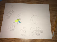
1. Creating my logo was very stressful but interesting and fun at the same time. I think what took me the longest time was figuring out whether I wanted to use my full name or just the initials of my name. I didn't want to use too sharp edges because I am a very gentle person and I wanted my logo to represent that. Choosing the colors wasn't very hard because I have so many favorite colors and I really like the soft colors I chose.

2. As I was creating my logo, or thinking about creating my logo, I was thinking about my favorite things. I was also thinking about my name and whether or not I could incorporate that into my finishing product. I didn't want to put so many things in the logo because I didn't want it to look stuffed. Keeping it simple and soft was my main priority.

3. The most important discovery I made while creating my logo is that logos are very, very hard to make. I've learned to appreciate all of the logos for all of these companies that we see around us on a day-to-day basis. Now I look at logos we've grown accustomed to seeing, like the UPS logo or St. Jude's Hospital for Children's logo, and wonder how long it took for them to be created.

4. I really liked the videos for the logos because of how informative they were. In the first video they were talking about the process of making logos and how they start with what the companies want people to see in their logos. They talked about capturing the essence of their business and how the people who make the logos then have to brainstorm. A lot of people are involved in creating just one logo, which I found to be extremely interesting. I really liked the videos.


Thursday, September 27, 2018

module 5: pianting picking paints a picture

Chloe Carr
Module #5

FULL HD PICTURES OF THE PAINTINGS CHOSEN


Maybe This Time It's The Angel Of Death from the Little Dancer series
     
        Artist: Jonathan Rogers
        Media: oil on canvas
        Year: 1990-2006

A) I think this artwork made a great impression on me for a number of reasons. For one, when I first saw it I thought the angel was something beautiful and nice in a place so gloom. After looking closely, I noticed there was a child cowering/hiding behind the corner like he's scared that the angel will see him. When I read the title I figured that the child is hiding from the angel because it represents Death.


  Shadow Road
        Artist: Gary Kyte
        Media: acrylic on canvas
        Year: n.d.

A) This artwork made an impact on me because I have never been able to look at a painting and feel like I hear it, if that makes sense. Ironically enough, I was looking at this painting in the museum and it felt like I was hearing nothing. Everything was silence and it felt like it was stemming from the painting itself, which I thought was magical.


Deliverance from the Visions of Faith series
        Artist: Jonathan Rogers
        Medium: oil on canvas
        Year: 2000

B) I feel a connection to this painting because of the meaning I found in it. I realize what I think of it could possibly be a reach but I can't seem to find any other meaning in it. When I look at this painting, I think about the story of the Devil and how he fell from Heaven. I look at this painting and think maybe he hadn't fallen, maybe he was given away. The angel seems to be leaving the hands of somebody much larger than it. I feel a connection to this painting because it looks like a combination of a world we do not see or that may not exist and the world we live in now.


Untitled

        Artist: Max Collins
        Medium: mixed media, wheat-pasted photo paper on wood
        Year: 1988

C) I would really like to know more about this painting because I am confused about what it might be. Originally looking at it, I figured it may be the twisted branches of a tree reaching up toward the sky, but after looking at it for some time, I thought maybe it could be veins; dark and black and scary and beautiful.


Group Self-Portrait #1 from the Group Self Portraits series
        Artist: Jonathan Rogers
        Medium: oil on canvas
        Year: 1998

B) I feel a connection with this painting because when I see this painting and relate it to the title, I think I understand it. To me, this painting is a self-portrait of not just one face of the artist, but the many different faces of the different people inside the same person. There is a normal-looking little boy in the center of the painting who could be the ultimate face of all the faces, which is why the rest of the scary-looking, raw, twisted-faced other faces are behind him. I feel a connection because I believe there are many different faces behind every face, and they're all scary in their own way.


Winter Nocturne
        Artist: Karl David Heerdt
        Medium: oil on board
        Year: 2007

C) I would really like to more about this painting because I was getting a different mood from it than the title suggested. Looking at this painting does not feel to me like winter, and it also doesn't feel like the setting is deep in the night. This looks to me like a gloomy, wet, humid day of Fall or Spring where the sky turns almost scary but pretty at the same time. I would really like to understand the painting through what the artist intended it to be seen.

Sunday, September 23, 2018

module 4: shades and colors and wheels, oh my

Chloe Carr
Module 4


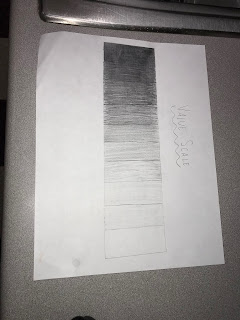
1. Value Scale: I like the final outcome of the value scale because of the different subtle transitions, but creating it felt very stressful. Some of the different shades became too close in color so much so that I had to go back and either darken a shade or lighten a shade.
    Color Wheel: I really liked creating the color wheel because it was very interesting to me. I especially liked mixing the colors. The final outcome didn't come out exactly as I thought it would, but I still like the way it looks and I liked the experience of making it.

2. I liked working with the paint more than the charcoal because it was cleaner to use. With the pencil, the lead would get on my hands and spread on the paper, changing some of the shades. With the paint, it was easier to mix with a brush and water.

3. The most important discovery in the creation of these studies that I didn't know before was that blue, red, yellow made the color black. I thought black was made just by combining all of the colors of the color wheel, not just blue, red, and yellow.

4. The most important information I learned from watching the videos from this project is that the primary colors are very important. The colors we see come from the primary colors; they come from a mix or combination of the colors. I think the videos were very helpful especially when I had to start mixing the colors of the paint.


Monday, September 17, 2018

Mandala Art

Mandala Art
Chloe Carr

1. There are many elements that come into making a mandala. Some of the  elements included are color, lines, shape, and space. We see color through the symbolic color that the monks use when they’re creating the mandala. There are lines and shapes because the monks choose to make geometrical shapes and spiritual symbols for their final piece. Space is shown because there is always space behind the subject of the mandala.

2. There is harmony, emphasis, and variety in mandalas. There is harmony because the sand makes the elements similar but the different colors of the sand make the final piece a work of art. Emphasis is shown because the colors used in the mandala stand out against the background colors. Using different shapes and symbols is an example of variety.

3. I found the process/ritual of creating a mandala to be very interesting. I thought it was interesting that monks have to go through so many lessons and memorize so many readings before they actually go through the process of setting down the sand. Another thing I found interesting is how they don’t keep the mandala; they give out half the sand to people and then dump the rest in rivers as a gift.

4. I found that mandalas are also used for art therapy in many places. The article I read said that therapists found that clients who created mandala art use it to better describe and explain how they are feeling, how they felt in the past, or how they want to feel in the future.

Sunday, September 16, 2018

module 3 part ii: colorful colors

Chloe Carr

Module #3 Part 2


1. Color is very powerful and has an effect on our emotions. Artists use it specifically for that reason, to affect its viewers when they see their art. Colors in paintings are almost always the very first thing that a person notices, and it's the first thing that allows you to decipher what the painting makes you feel. The video we watched says that when an artist uses different shades of the same color, it makes the painting have a very subtle change in emption without completely changing what the painting makes you feel originally when you notice the main, obvious color. All colors have an effect on us because all colors are associated with an emotion or emotions.

2. I find the color wheel to be most fascinating to me. This is because this is a concept that's always stuck with me and a concept I find more beautiful than any other theoretical aspect of color. We can especially see the color wheel in rainbows after it's rained and when it reflects on the wet ground. We can also see the rainbow in tiny pools of oil by a street curb or in some earings.

3. In the color video, I really like the idea that color affects other colors in a paintings. I've always thought the only affect color has is on a person that sees it, but after watching the video, it became obvious that colors can work together in a painting or can work against each other. Another thing I like is when the artist in the video said, "The color in the painting keeps it alive for me." To me, this means that the painting relies heavily on the painting, which is absolutely true though I never really noticed it.

4. The relationship between color and negativity made the biggest impact on me in regards to color and its effects on emotion. This is because the man in the video at some point makes the connection that negativity is an, "all enveloping darkness." To prove this point, he then shows a painting where the colors are dark and the expressions on the faces of the people are twisted in what appears to be pain.

module 3: art elemented?


elements of art
elements of art embedded

Chloe Carr
Module #3

This project was very interesting yet challenging for me. I've never really though much about the elements of art until I found myself looking for them in my everyday life. People have always said that art is always around us, and now I truly understand how true that statement is.

Lines: The very first picture I took was the image of the fan. After I took it I realized that it could represent two separate elements of art; lines and motion. The reason I decided to let it represent lines is because I feel like the lines are more obvious than the moving blades.

Value: The black and white, or noir image of a chair against a wall was chosen to represent value because of the heavy contrast between black and white and the different shades of gray.

Space: Space is shown in the picture of a hand holding Christmas lights because of the area behind and above the hand and lights. I struggled a little while finding a way to show space but I think out of all of the pictures I took that could have represented space, the picture I chose was the closest one.

Movement: The water in the image shows movement because the water is being sprayed out of the spout and then jumps in different directions when it hits the surface of the sink, which is shown in the picture itself.

Contrast: The potholes in grass shows contrast for mutltiple reasons. For one, the actual texture of the potholes is extremely different than that of the grass, which is much softer. Secondly, the vibrant green color of the grass is a big contrast to the copper color of the pot holes.

Pattern: This element seemed to me the most easiest because it was easier to recognize a pattern than any other element. The image displayed in the photo album for patterns shows a living room carpet that has a very interesting pattern on it.

Texture: The ground is split in half to reveal one side with a design and another side with plain cement. This shows texture because you can see how high off the ground the cement with the design is and you can almost imagine how it feels if you were to actually touch it.

Emphasis: I really like the picture I took for emphasis because it was one of the hardest pictures I took while I was doing this project. The bottle cap on the table stands out more for emphasis because the background is blurred and that is the only thing that has a focus.

Unity: The image of the sunflowers shows unity because it shows balance in the sea of flowers regardless of the fact that not all of them are pointing in the same exact direction.

Balance: Balance is shown in the image of the sun above clouds in the sky because of the slight division of the clouds and sun. There is also a very subtle symmetry in the image.

Proportion: There is proportion in the picture I took because everything in the image has its own perspective size and shape. There's depth in the sky and the gate on the grass is as it should be when compared to the grass and sliver of buildings in the background.

Shapes: The picture of the gutter with designs next to the ground that has lines shows shapes because the design in the gutter are made out of shapes.

Form: The chair shows form because a form is defined as an object that is three-dimensional.

Color: You can see the different colors in the ball on the wall through the bends and folds of the reflective paper/aluminum itself.

Sunday, September 9, 2018

module 2: philosphically art


Chloe Carr
Module #2


1. The first video was very interesting to watch. The basics of what I've learned is that the philosophical study of beauty and art is called aesthtics. The philosophy of art is what art is; what makes something a work of art. Through the philosophy of art we can decipher between whether or not something is a work of art. The video went on to explain how art was potrayed in the 5th century, and especially what important people contributed to the idea and definition of art. Some of these people included Plato, Aristotle, Aleberti, Addison, Shaftburry, and Baumgarten. Something I learned that I found extremely interesting is Aristotle's idea of the forms of beauty. He believed that the forms of beauty were made up of three things: order, symmetry, and defiteness. Like Aristotle, Alberti believed that beauty was harmony and that there were principles of formal order or neoclastical aesthetics, which were proportion, symmetry, harmony, and order. This video expanded a lot about what aesthetics meant to each of the philosophers mentioned.

The second video focused more on what a work of art is and what aesthetics meant for art. Jean-Pierre Changeux described works of art as, "human productions specialized for intersubjective communications" that uses symbolic forms. This to me means that art is something made by people to be understood by the minds of other people. He believes that art is something outside of verbal language.

2. After the 18th century in England where there formed a foundation for aesthetics, Shaftsburry also came to be of influence. I find his theory on aesthetics to be very important because it's closest to what I want to believe about aesthetics. Shaftsburry said there was no true aesthetic delight that did not include good, or any true, moral pleasure that did not include beauty. Basically he meant that beauty and good are the same thing. He also said that there is a certain harmony to art as harmony is a sign of divine order. To Shaftsburry, any work of art that has beauty and harmony is taken through our senses so that we can actually see the beauty. It's strictly for the mind. He contributed so much so to the idea of aesthetics that other philosophers, especially Francis Hutcherson, spent most of their career building onto his belief.

3. Though Changeux spoke a lot about works of art and how something can become a work of art, he also spoke about aesthetics. During his lecture, he defined aesthetics as the, "staggering affects on emotion and reason mobilising conscious and non-conscious processes." In saying this, he's saying that the effect a work of art has on a person can be defined as the aesthetics of that work of art, whether that emotional effect be conscious or non-conscious. He showed examples by showing the human skull and the change over time. He showed the symmetry of the skull and space of the brain inside of it.

Ramachandran talked more about neurological theory of art and came up wih the science of art, which I found pretty interesting. He believes that art is about asserting human individuality and science is about discovering universal principles. Ramachandran argued that unlike the belief that art and science should never meet as they are opposites, they will always meet when it comes to the brain. He first noticed the relationship when he became fascinated by art from a place he had been visiting. The effects of the art were so powerful that he started thinking about them very often, which lead him to believe that there was an effect of art and its meaning on the human mind. His talk elaborates on that discovery and the history of the reactions of people brought on by art which should not always be realostic. I liked that he was able to find an unrealistic approach to art while also using science to explain why art means so much to people.

4. Like the videos, the readings in the text also focus on the history of art. The book defines aesthetics as the, "branch of philosophy concerned with feeling aroused in us by sensory experiences. This means that there is a relationship between art and our five senses. It also goes indepth about the history of art and the meaning it serves and has served for centuries. The book gives examples like the carvings in Chauvet Cave to explain that art has been around since the Paleolithic era. The article we had to read says that we recognize art and recognize that images we see can be clear representations of things or places or people we see in our everyday life. The book, not unlike the article, says that some images we see may not be art, "but our ability to make them is one place where art begins." Both the article and the book can relate to the videos because the videos expand on the relationship between art and humans. Ultimately, we are able to find beauty and art in images that we see because of how our brains work and how they are wired. We are able to find meaning in even the most unrealistic kinds of art.

5. The films and article helped me better understand the reading in the text by expanding more behind the background. The book gives examples of what the films and article were saying. For example, the article explained how lines were an important aspect of art. Line drawings, according to the article, date back to centuries ago during the time of our great ancestors. I would not have thought much about that fact until I saw the cave drawings outlined by lines in the textbook. I never thought about the fact that outlines in drawings serve such a heavy meaning.
module #15: me myself and i

Chloe Carr 12/13/18          1. I selected the inspired pieces because I've always been a fan of Frida Khalo and the way she...